 Skip to Navigation


A developer can’t code an HTML email template using the same technologies and approaches as one would when building a web page. It may sound ridiculous, but it’s the truth. So, let’s try to figure out how valid this statement is.
Email clients with no standards
While coding a web page, an engineer takes the following factors into consideration:
- operating system
- browser type
- screen size
When building an HTML email template, in addition to the operating system and screen size, one has to account for the email client.
There is a wide selection of email clients that encompasses several web and desktop solutions, where the way an email is displayed depends largely on the rendering engine a system uses.
Of course, a universal set of standards would be much easier for email clients to support and for developers to comply with. But, unfortunately, we don’t have any. Every email client plays by its own rules. That’s why the rendering of CSS by various email clients may differ significantly.
Top 10 email clients in 2018
In June 2018, Litmus released an Email Client Market Share report which was based on 1.04B email opens data they gathered worldwide. One can review this report to get an idea about the core market players and their shares in this area.

Know what email clients your target audience prefers
Although having access to the general stats provided by Litmus is great, we would recommend you check what devices and email clients your target audience uses. Having this information at hand will simplify the email development process by reducing the number of devices and email clients an engineer has to tailor an email for.
If you are using Mailchimp, go to List and check the following stats:

If you are using Sendgrid, go to Stats, and then Email Clients & Devices. Sendgrid will provide you with several respective categories: Top Devices, Top Webmail Clients, and Top Desktop Clients.


Outlook email client
According to the Litmus Email Client Market Share report, Outlook ranks #5 with a 7% market share. However, not everyone knows that Outlook for Windows still uses the Microsoft Word engine for rendering. At the same time, Outlook for Mac supports almost any kind of HTML and CSS formatting.
Below are only some of the aspects a developer should bear in mind when adjusting an email template for an Outlook email client:
- Outlook does not “understand” HTML bulleted list tags
- Outlook uses Times New Roman as the default font
- Outlook may add a page break to an email if it exceeds 1800px
- Outlook cleans up paragraph and margin spacing
- Outlook does not support background images
Of course, some of the above-mentioned cases may be solved by using a “table” tag structure in an email template, while others require special tricks and workarounds that engineers may apply to ensure correct email rendering.
The best ways to create HTML emails
There are some aspects that one should consider when building HTML email templates. Let’s review the suggestions below.
Use simple design
We recommend developers keep the email design simple. Apply grid-based layers and stay away from the elements that include positioning or HTML floats.
Adjust HTML emails to different screen sizes
With Apple iPhone email client ranking #1 in the recent Litmus report, one can see clearly that it is crucial for an email template to display well not only on desktop but also on tablet and smartphone.
To succeed with this task, one can try using scalable, fluid, or responsive design. So, let’s dive a bit deeper into each type of design to choose the one which will suit your requirements best.
Scalable HTML email design
This type of design presumes the presence of a minimum number of structural elements in an email. That’s why it usually consists of one text column that can be easily scaled for all types of devices, one image, and a Call to Action (CTA) button.
Fluid HTML email design
The fluid design uses percentages to adjust to a recipient’s screen size by filling up all space in an email just like fluid would do in an empty container. However, to make sure an email’s content does not cover all the available screen area, it is recommended to configure the table’s maximum width. It’s a common practice to set the default width to 600px.
Responsive HTML email design
Utilizing responsive design, in turn, allows sending customized HTML email templates that may automatically adjust not only the size but also the content depending on a recipient’s device and screen size. The desktop and the mobile version of an email may differ significantly from each other or may be alike. In the end, a desktop version of an email may include more or different components than a mobile version and vice versa, which makes this type of design universal for all devices and screen sizes (existing and newly introduced).
Media queries, introduced in CSS3, empower responsive design. The top email clients are well aware of what media queries are. However, it’s worth keeping in mind that there are still email clients that won’t succeed with their rendering at all.
Think about mobile users
Working with HTML email design, one should remember the golden rule – mobile design goes first. I.e., a mobile version should be checked first to decrease the loading time on small devices. For instance, the first condition may be set as “larger than 768 pixels”.
Choose the right fonts
Many email clients won’t be able to render Google Fonts properly. In this case, one should opt for the common fonts that the major email clients interpret well. Such as Times New Roman, Arial, Georgia, and Verdana.
Take images seriously
Some email clients block images by default and some users may amend their inbox settings to block images if the client isn’t doing it. So, it is best to follow the advice below when coding an email template:
- Accompany your image header with text to make sure that a user will still understand what the email is about, even if the image gets blocked.
- Don’t build HTML emails that consist of one or two large images only. If one of them or both are not displayed properly, it will ruin the entire email campaign.
- Keep your emails simple by adding just enough images and text to guarantee that your message still makes sense even if all images are blocked.
- If your email includes a call to action (CTA) in the form of a button, don’t use an image to format the CTA. Instead, you can try to create a padding-based button. This simple method uses both HTML and CSS for button building.
Last but not least: keep in mind the email size. The maximum file size limits for emails are pretty high, but the recommended size of the email body should not exceed 250KB.
For more development tips and code samples, check our guide on building HTML Email.
Otherwise, you can try using an HTML email builder. They usually come with a set of customizable email templates, which can be used in any email sending system. In this post, we have reviewed the ten tools suitable for both developers’ and marketers’ needs.
HTML email testing
Before sending out an HTML email campaign, it is worth checking whether your emails will get delivered to recipients or end up marked as spam, as well as getting some email rendering advice.
For this, we recommend using a solution such as Mailtrap Email Sandbox, which provides you with a safe environment for inspecting and debugging testing emails, so you don’t accidentally end up spamming recipients.
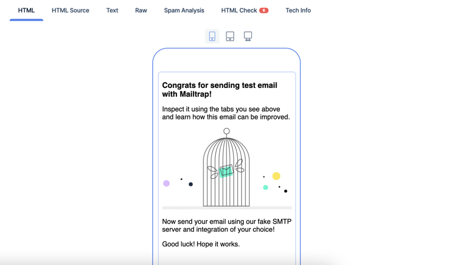
Mailtrap Email Sandbox comes in especially handy for testing HTML emails as it provides a range of features intended specifically for this purpose. So, once you send your first test email to Mailtrap Email Sandbox (process described in detail here), you will be able to:
- View how your email is rendered by a browser and check its responsiveness in the HTML tab.
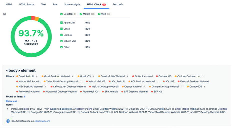
- Scan through your email’s HTML code for problematic elements, gain insight into which email clients don’t support or only partially support those problematic elements. Furthermore, in the HTML Check tab, you can get an estimate of how your email code is supported across popular email clients.
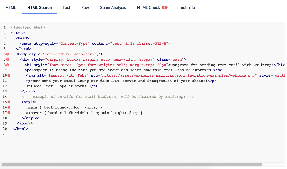
- View the HTML markup in the HTML Source tab.
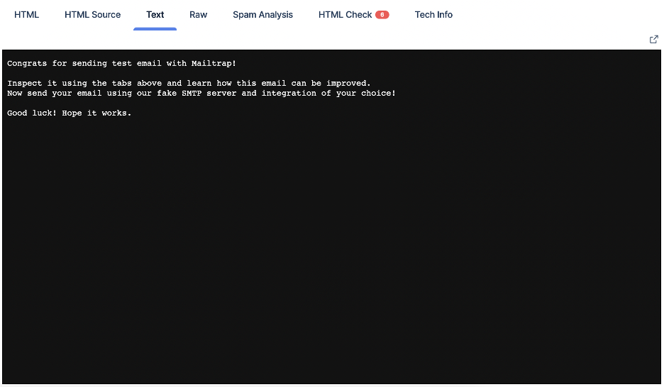
- View the email’s text part (the message displayed when the HTML cannot be) in the Text tab.
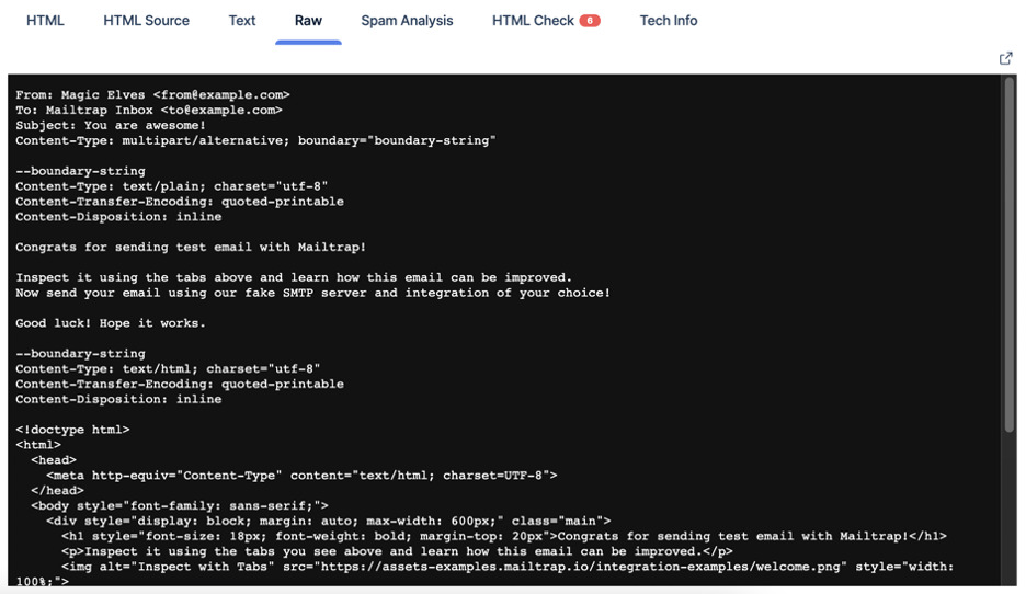
- Preview the email in raw format in the Raw tab.
Other features of Mailtrap Email Sandbox include multiple virtual inboxes for different projects and project stages, blacklist reports for your sender IP/domain, spam analysis, manual and automatic email forwarding to whitelisted recipients, and insight into detailed tech info – essentially everything one needs for advanced email testing.
To get started with this solution, all you need to do is sign up for a free Mailtrap account and complete a 5-minute setup. After that, you can start exploring all the mentioned Email Sandbox features.
Conclusion
We hope that this blog post addressed some of the core aspects you should be paying attention to when crafting an email template. In addition, we just wanted to remind you one more time how important HTML emails testing is 😉
